As the UN adopts an equal world map, meet the three geographers who disputed how the Earth was charted 2000 years ago
https://theconversation.com/as-the-un-adopts-an-equal-world-map-meet-the-three-geographers-who-disputed-how-the-earth-was-charted-2000-years-ago-293297
@TheConversationUK @map_enthusiasts #maps #cartography #geography
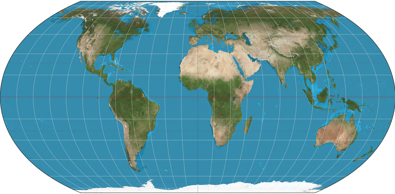
I maintain the opinion that this is a worse projection than what we had. Yes, the proportions are more accurate but the readability of the map got worse. The countries that already were perfectly visible front and centre are now even more visible whereas most of Europe is now just one incoherent blob.
Back in my school days our text books used the Winkel Tripel projection and even that was much better.
Not inaccurate. Trollololol.
Europe is a relatively small region, an appendix to Asia if you will. When needing more acuity, use a map of Europe.
I don’t think Europe is that bad in this projection, but Scandinavia is getting rather flattened.
Obviously all these projections suck, but I also agree Winkel Tripel is nicer, even if it looks goofier at a distance.
https://map-projections.net/compare.php?p1=winkel-tripel&p2=equalearth&sps=1
Winkel-Snyder looks less goofy at a glance than Winkel Triple.
If you want a wider aspect ratio, Natural Earth is less goofy than Equal Earth.
You’re gonna love this:
https://www.youtube.com/watch?v=QMlp8BeBJgg