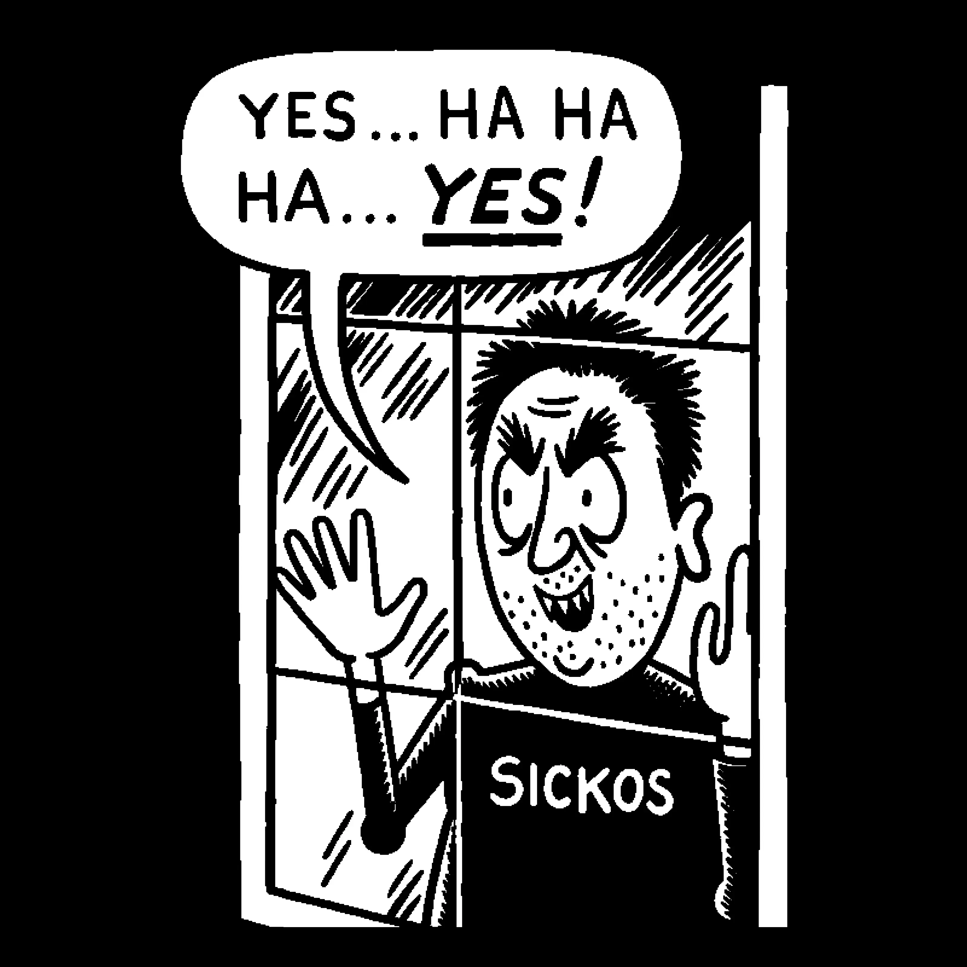
I don’t even know what it’s called, but I really hope it goes the way of Comic Sans
Edit: does anyone actually know what this awful font is called?
Comic Sans was hand-crafted, technically excellent, highly legible and served it’s purpose perfectly. The only thing it has in common with this shite is that people used it for fucking e-v-e-r-y-t-h-i-n-g.
I love comic sans just because it’s the easiest to read. I write everything in comic sans and then reformat afterwards.
Is there a monospaced version of comic sans for programming?
Yes: https://dtinth.github.io/comic-mono-font/
I used it for a while thinking it helped me, but actually turns out I just needed a bigger font size
It’s apparently not just limited to English. Not that it would be, guess I just never thought about it.

Octoberfest this year had a lot of stands, all with the same AI slop posters. I bought a burger from a stand with just a handwritten sign. Felt good.
This fucking shite

It’s the iconic design for this generation and in 10 or 15 years, people will be nostalgic for that
this is an insult to comic sans; that ai font is way worse than it
Just found another one in the wild
It isn’t really a specific font, just something AI models made to generate images have picked up on. Things that were immediately attention grabbing and bold probably got more positive scoring and reinforcement during training, so they learned to use larger more dramatic styles (this is also why you often see sort of electric or fiery glows, sparks, dramatic lighting, etc) but that doesn’t really work to help a business stand out when all of them now look like that.
I’m also not sure if everyone knows this yet, but most AI image generators nowadays are split into two parts. It used to be that you’d need a prompt like
poster, graphic, promotional, large text, dramatic, brushstroke font, on sign, city background, club background, microphone, This Font is the New Comic Sans bold text, high quality, but since most people do this shit through something like ChatGPT, and might just say “make me a poster that says ‘This Font is the New Comic Sans’”, in the background, an LLM takes that prompt and makes a more extended prompt for the image generator.This is where a lot of this type of thing probably takes place. For example, I prompted an AI model with
Convert this prompt: "Make me a poster for my nightclub" into a Stable Diffusion prompt for a poster, and it gave me: nightclub event poster, bold neon typography, vibrant magenta and electric blue lighting, silhouetted dancers in motion, smoke and laser beams, glowing geometric shapes, dark moody background, high contrast, synthwave aesthetic, centered composition, space reserved for event title and date, ultra detailed, sharp focus, professional graphic design, 8k (emphasis added by me)Nightclub posters do sometimes have these elements, but a lot of them actually use clean typography, little to no neon inside the typography, it just made up synthwave as a relevant aesthetic to the club it knows nothing about, and simultaneously wants a dark and moody background… with something that has high contrast, neon lights, lasers, and lighting everywhere.
Both image generators and LLMs optimize for things that are bold and for excessive additions like you saw in the prompt earlier, which leads to the super sloppy, over the top, crowded designs you see on most AI posters.
The essential qualities of a good typeface balance visual beauty with practical function. This is just plain ugly and makes Comic sans look elegant. Using this crud is as acceptable as attending a funeral dressed as a clown.

Comic Sans was - is - a frigging superb font. It was destroyed by being abused.
This is an insult to comic sans. Comic sans is a good font and helpful to people with dyslexia
Comic sans (originally designed for a comic dog character) is an awful typeface. It is constantly misused in serious settings such business contracts, medical notices, and legal documents. In the UK many schools use it. It is as appropriate as wearing a clown costume to a funeral. Using it makes any professional design look childish, sloppy, or amateurish There is very little peer-reviewed scientific evidence that Comic Sans inherently improves reading performance for students with dyslexia.

Yes Comic Sans is an awful typeface, but even the worst, most garbage looking human made typeface is still preferable to the ai slop-font.
Normally I would be all for peer reviewed, but this is a fantastic example where that’s a stupid fucking metric.
Comic sans existed before efforts to formally make a dyslexic assistance font.
Comic sans has been casually recommended by many dyslexic communities and assistance programs because sans serif fonts are helpful and fonts with unique letter shapes are helpful.
Comic sans for many years was one of the only fonts that fit both categories. But by the time formal efforts went into place, comic sans quickly became unneeded in the space. There’s no reason at all TO do a formal study on it when it was never intended for the use case.
What studies there are in fonts from the time lean towards it being helpful for reading speed and understandability in children. But none of the studies of the error really focused on dyslexia so at best you can only infer based on adjacent findings it even then it’s loose at best.
Point is just because something doesn’t have formal research on it doesn’t make it not true and that years of casual helpfulness just vanish.
So get off the little petty wagon where you hate something just because it’s overused. Comic sans is a useful and fun little font that just gets over used.
At least comic sans is easy on the eyes. easy to read.
You might need new glasses.
That is literally one of comic sans upside. Its objectively speaking easy to read. Its one of the better fonts for people with dyslexia and reading difficulties.
People hate on it because memes and ignorance. Also the absolute over use making people sick of it. But those are subjective things.
This ! This is the exception for the rule : never slop